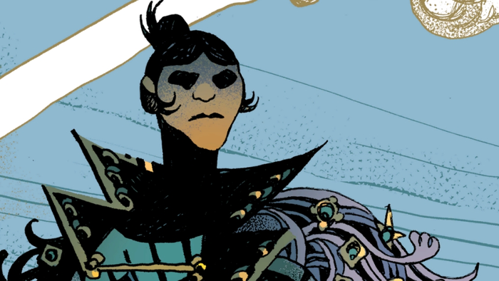
Introduction
Computer
games traditionally have a player control one or more units on the
screen. In early games, each player controlled one unit. As CPU power
grew, players controlled more and more units. Today, a player might
have hundreds of units, each one of which they must control
individually. The unit-based user interface (UI) is no longer
sufficient. This article will suggest a different way of thinking about
UIs, and will discuss how to compare one UI to another, or one UI to
the theoretical maximally efficient UI, to tell if your game can be
improved. I’ll use examples primarily from strategy games, but it
applies to UIs for programs of all kinds.
Approaching a Thousand Clicks a Turn
My favorite game of all time is Civilization,
in all its incarnations. When I introduce friends to the game, they’re
enthusiastic for one or two thousand years – which, in Civ,
means about a hundred turns. By then the cities, the units, and the
waiting have multiplied so much that it becomes, for the novice, a
chore more than a game.
Even for a Civ
addict like me, the game isn’t much fun after about 1800. Too many
clicks. I counted the clicks, mouse movements, and keystrokes that it
took me to get through one move of Civilization III in the
year 1848. Many hours later, when that turn was done, I’d counted 422
mouse clicks, 352 mouse movements, 290 key presses, 23 wheel scrolls,
and 18 screen pans to scroll the screen. This was making full use of
all the Civ shortcuts, automation, and group movements. I probably would have made twice as many movements if I hadn’t been counting.
You may wonder why I’m talking about Civ III, when Civ IV has been out for months. I never bought Civ IV. I’d been waiting and hoping for a more playable Civ. What finally arrived was a Civ that takes just as many clicks, but with a new animated 3D UI.
Don’t get me wrong – Civ IV
has important new gameplay aspects. Firaxis did far better than
companies who create some new units, artwork, and cut scenes, and call
it a new version. But I didn’t stop playing Civ III because I was tired of the game, or because it wasn’t pretty enough. I stopped because it takes too long to play a game. Civ didn’t need a prettier interface – it needed a more efficient one.
Overclick isn’t limited to Civilization. Real-time strategy games will leave you with even worse carpal tunnel. That’s why I don’t play Warcraft
or its descendants online. In terms of clicking skills, I’m over the
hill. Strategy is irrelevant in today’s real-time strategy games when
you’re playing against a fourteen-year-old who can click twice as fast
as you.
The RTS user interface hasn’t improved since Total Annihilation
(1997), which had more useful unit automation than many current games.
Meanwhile, the number of objects our computers can control and animate
has increased, and continues to increase, exponentially. The old UI
model isn’t at the breaking point – it’s broken.
This article is about how to design a UI that lets players communicate
their intent with fewer clicks. I’m not going to address UI ergonomics
(physical ease of use) or cognitive ergonomics (issues such as
eyestrain and human memory and processing requirements). The energetic
reader should incorporate those as well into their UI evaluation, but
it’s too complex for this short article.
|