Sponsored By
News
Key art for the shelved PC game Ironmarked.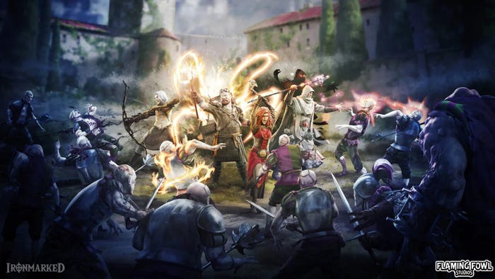
BusinessFlaming Fowl lays off staff after unveiling demo for its (shelved) gameFlaming Fowl lays off staff after unveiling demo for its (shelved) game
Flaming Fowl is making a last-chance bid to attract publisher interest by releasing a demo for Ironmarked.


Latest News
Trending

Featured Blogs


Daily news, dev blogs, and stories from Game Developer straight to your inbox