Sponsored By
News
Players in a skirmish in Overwatch 2.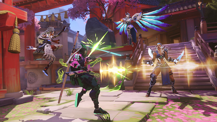
BusinessBlizzard cancels BlizzCon 2024, will host smaller in-person eventsBlizzard cancels BlizzCon 2024, will host smaller in-person events
Even-numbered years aren't kind to Blizzard, it seems.


 Cécile Russeil.")


Latest News
Trending

Featured Blogs


Daily news, dev blogs, and stories from Game Developer straight to your inbox