Sponsored By
thumbnail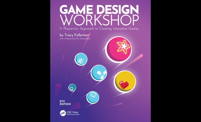
DesignBook Excerpt: Game Design Workshop, 5th EditionBook Excerpt: Game Design Workshop, 5th Edition
'This updated 5th edition brings deeper coverage of playcentric design techniques, including setting emotion-focused experience goals and managing the design process to meet them. It includes a host of new diverse perspectives from top industry game designers.'


Latest News

Trending

Featured Blogs


Daily news, dev blogs, and stories from Game Developer straight to your inbox