Game Developer is part of the Informa Tech Division of Informa PLC
Informa PLC
|
ABOUT US
|
INVESTOR RELATIONS
|
TALENT
This site is operated by a business or businesses owned by Informa PLC and all copyright resides with them. Informa PLC's registered office is 5 Howick Place, London SW1P 1WG. Registered in England and Wales. Number 8860726.
Game Market Research
GDC Vault
GDC
Advertise With Game Developer
Stay Updated
Stay Updated
News
Trending
Related Topics
Game Industry Layoffs
GDC 2024 Coverage
Generative AI
Investments & Aquisitions
Unionization
Top Stories
Business
Game Design
Marketing
Programming
More
Related Topics
Interviews
Q&A's
Deep Dives
Postmortems
Culture
Business
Marketing
Design
Programming
Production
Art
Audio
Recent in
More
Read More: Business
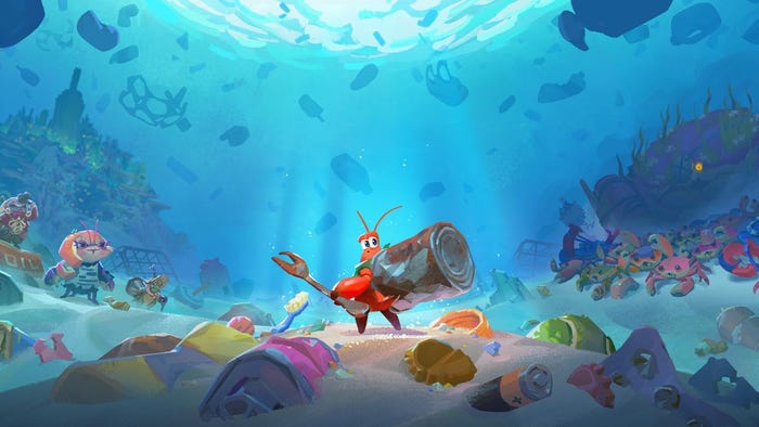
Key art for 2024's Another Crab's Treasure.
Business
Another Crab's Treasure sells 30,000 units within its first day
Another Crab's Treasure sells 30,000 units within its first day
by
Justin Carter
Apr 26, 2024
1 Min Read
thumbnail
Business
Why AI Isn't The New Crypto In Gaming
Why AI Isn't The New Crypto In Gaming
by
Tess O'Leary
Apr 26, 2024
3 Min Read
Blogs
Related Topics
All Blogs
Featured Blogs
Blogging Guidelines
Blog Now
See All
Jobs
Related Topics
Game Artist
Game Animation
Video Game Designer
Game Programmer
Gameplay Engineer
Education
More Jobs
See All
Sponsored By
Home
Features
Features
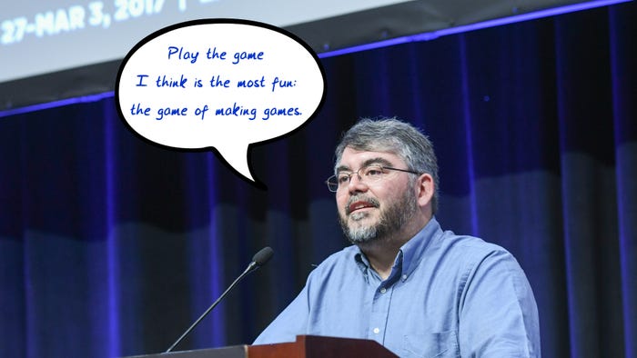
Raph Koster with a word bubble saying "Play the game I think is most fun: the game of makin ggames."
Design
Raph Koster wants developers to get back to 'the game of making games'
Raph Koster wants developers to get back to 'the game of making games'
by
Bryant Francis
Apr 26, 2024
6 Min Read
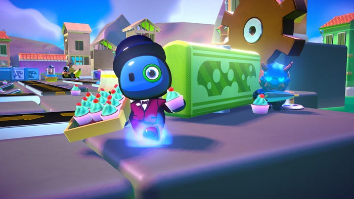
A screenshot from Rumble Club. A cute player character with a monocle and top hat looks at the camera.
Business
Mad Mushroom explains what devs might expect from a streamer-owned publisher
Mad Mushroom explains what devs might expect from a streamer-owned publisher
by
Bryant Francis
Apr 24, 2024
10 Min Read
Design
Warren Spector says the next logical step for immersive sims is multiplayer
Warren Spector says the next logical step for immersive sims is multiplayer
Apr 16, 2024
|
6 Min Read
by
Bryant Francis
PC
Ubisoft wall-runs onto the roguelike bandwagon with The Rogue: Prince of Persia
Ubisoft wall-runs onto the roguelike bandwagon with The Rogue: Prince of Persia
Apr 10, 2024
|
5 Min Read
by
Alessandro Fillari
PC
Dominic Law has a plan to make Neopets last for another 25 years
Dominic Law has a plan to make Neopets last for another 25 years
Apr 8, 2024
|
6 Min Read
by
Bryant Francis
Design
One subtle change brought Star Wars: Jedi Survivor's 'Dark Side moment' to life
One subtle change brought Star Wars: Jedi Survivor's 'Dark Side moment' to life
Apr 5, 2024
|
6 Min Read
by
Bryant Francis
Audio
Did you know Tears of the Kingdom has 'a physics engine for sound'?
Did you know Tears of the Kingdom has 'a physics engine for sound'?
Apr 4, 2024
|
12 Min Read
by
Bryant Francis
Design
Player 'stunts' in Breath of the Wild gave Nintendo 'confidence' to push boundaries in Tears of the Kingdom
Player 'stunts' in The Legend of Zelda: Breath of the Wild gave Nintendo "confidence" to push boundaries in Tears of the Kingdom
Apr 3, 2024
|
4 Min Read
by
Bryant Francis
Programming
Unity sees WebGPU as a growing market for game development
Unity sees WebGPU as a growing market for game development
Apr 2, 2024
|
3 Min Read
by
Bryant Francis
Programming
Why (and how) you should leave Unity and Unreal to make your own engine
Why (and how) you should leave Unity and Unreal to make your own engine
Mar 20, 2024
|
5 Min Read
by
Michael Higham
Design
Avoiding the 'compliment sandwich:' Techniques for mentoring others in the art of level design
Avoiding the 'compliment sandwich:' Techniques for mentoring others in the art of level design
Mar 20, 2024
|
4 Min Read
by
Imran Khan
Marketing
'Don't show hole' and other good advice from the Baldur's Gate 3 TikTok account
'Don't show hole' and other good advice from the Baldur's Gate 3 TikTok account
Mar 19, 2024
|
5 Min Read
by
Holly Green
Mobile
Here's what happened when Rovio integrated AI into its customer service pipeline
Here's what happened when Rovio integrated AI into its customer service pipeline
Mar 15, 2024
|
7 Min Read
by
Bryant Francis
Business
What VC firms like The Games Fund are looking for in studios right now
What VC firms like The Games Fund are looking for in studios right now
Mar 14, 2024
|
5 Min Read
by
Bryant Francis
Production
How Flix Interactive aimed to be a good co-development shipmate on Sea of Thieves
How Flix Interactive aimed to be a good co-development shipmate on Sea of Thieves
Mar 13, 2024
|
6 Min Read
by
Alan Wen
Design
How the iconic Jeff Minter stays inspired after 43 llama-filled years of game development
How the iconic Jeff Minter stays inspired after 43 llama-filled years of game development
Mar 12, 2024
|
22 Min Read
by
Sam Machkovech
Business
Why are Valve and Discord permitting harassment against Sweet Baby Inc.?
Why are Valve and Discord permitting harassment against Sweet Baby Inc.?
Mar 11, 2024
|
7 Min Read
by
Bryant Francis
Design
Hearthstone celebrates its 10th anniversary by balancing novelty with nostalgia
Hearthstone celebrates its 10th anniversary by balancing novelty with nostalgia
Mar 11, 2024
|
7 Min Read
by
Diego Arguello
Programming
Owlchemy Labs CEO Andrew Eiche thinks devs should be bullish about AI
Owlchemy Labs CEO Andrew Eiche thinks devs should be bullish about AI
Mar 8, 2024
|
8 Min Read
by
Bryant Francis
Design
Two pillars devs need to know to pitch a Dungeons & Dragons game
Two pillars devs need to know to pitch a Dungeons & Dragons game
Mar 7, 2024
|
2 Min Read
by
Bryant Francis
Production
Why the former Borderlands boss is betting big on UEFN development
Why the former Borderlands boss is betting big on UEFN development
Mar 7, 2024
|
7 Min Read
by
Bryant Francis
Design
The 'Pawns' of Dragon's Dogma 2 are the tip of an emergent iceberg
The 'Pawns' of Dragon's Dogma 2 are the tip of an emergent iceberg
Mar 5, 2024
|
7 Min Read
by
Alessandro Fillari
Mobile
Toymaker Mattel is becoming a mobile game publisher
Toymaker Mattel is becoming a mobile game publisher
Mar 5, 2024
|
2 Min Read
by
Bryant Francis
Programming
Alan Wake 2 was 'the right time' for Remedy to invest in live-action video, says Sam Lake
Alan Wake 2 was 'the right time' for Remedy to invest in live-action video, says Sam Lake
Feb 27, 2024
|
3 Min Read
by
Bryant Francis
Art
Why art from the '70s is great inspiration for games like Cocoon
Why art from the '70s is great inspiration for games like Cocoon
Feb 26, 2024
|
2 Min Read
by
Bryant Francis
Design
MLB The Show's Negro Leagues inclusion 'needed to tell a story'
MLB The Show's Negro Leagues inclusion "needed to tell a story"
Feb 26, 2024
|
3 Min Read
by
Bryant Francis
Extended Reality
Some players have spent over 250 hours in Asgard's Wrath 2
Some players have spent over 250 hours in Asgard's Wrath 2
Feb 23, 2024
|
2 Min Read
by
Bryant Francis
Marketing
Cyberpunk 2077's embattled launch was felt across Poland
Cyberpunk 2077's embattled launch was felt across Poland
Feb 23, 2024
|
4 Min Read
by
Bryant Francis
Marketing
What do developers think about the success of Palworld?
What do developers think about the success of Palworld?
Feb 2, 2024
|
10 Min Read
by
Bryant Francis
Design
How Memory Shards help players find secrets in Prince of Persia: The Lost Crown
How Memory Shards help players find secrets in Prince of Persia: The Lost Crown
Jan 31, 2024
|
4 Min Read
by
Bryant Francis
Business
Former Bungie general counsel says the game industry must unionize
Former Bungie chief legal officer: "the game industry must unionize"
Jan 25, 2024
|
7 Min Read
by
Bryant Francis
Art
Prince of Persia: The Lost Crown makes neat use of mocap tech
Prince of Persia: The Lost Crown makes neat use of mocap tech
Jan 19, 2024
|
3 Min Read
by
Bryant Francis
PC
What devs tackling morality can learn from War Hospital's card system
What devs tackling morality can learn from War Hospital's card system
Jan 18, 2024
|
3 Min Read
by
Bryant Francis
Design
Why this dev made a spiritual sequel to the infamous CD-i Zelda games
Why this dev made a spiritual sequel to the infamous CD-i Zelda games
Jan 8, 2024
|
7 Min Read
by
Paul Cecchini
Production
Why Don't Nod Montreal will probably be "the last studio" to adopt AI
Why Don't Nod Montreal will probably be "the last studio" to adopt AI
Jan 4, 2024
|
7 Min Read
by
Bryant Francis
Previous
1
2
3
4
5
…
110
Next
Latest News
Key art for 2024's Another Crab's Treasure.
Business
Another Crab's Treasure sells 30,000 units within its first day
Another Crab's Treasure sells 30,000 units within its first day
by
Justin Carter
Apr 26, 2024
1 Min Read
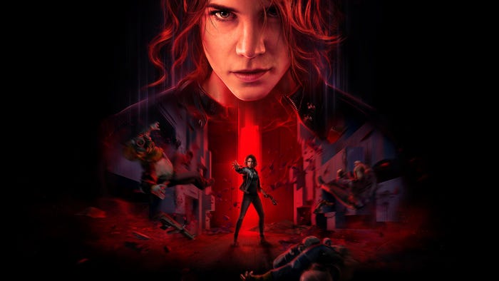
Jesse Faden in Remedy Entertainment's Control.
Business
Remedy adds Control director Mikael Kasurinen to central management group
Remedy adds Control director Mikael Kasurinen to central management group
by
Justin Carter
Apr 26, 2024
1 Min Read
Get daily news, dev blogs, and stories from Game Developer straight to your inbox
Subscribe to Game Developer Newsletters to stay caught up with the latest news, design insights, marketing tips, and more
Stay Updated
Trending
thumbnail
Business
Valuing Remote Employees in Hybrid (and Remote) Settings
Valuing Remote Employees in Hybrid (and Remote) Settings
by
Deborah Chantson
Apr 26, 2024
8 Min Read
thumbnail
Business
Why Doesn't Everyone See the Importance of Preserving Our Past?
Why Doesn't Everyone See the Importance of Preserving Our Past?
by
Warren Spector
Apr 26, 2024
4 Min Read
The Thunderful logo on a black background
Business
Struggling publisher Thunderful divesting Nordic Game Supply
Struggling publisher Thunderful divesting Nordic Game Supply
by
Chris Kerr
Apr 26, 2024
2 Min Read
Featured Blogs
Business
Valuing Remote Employees in Hybrid (and Remote) Settings
Valuing Remote Employees in Hybrid (and Remote) Settings
Apr 26, 2024
Business
Why Doesn't Everyone See the Importance of Preserving Our Past?
Why Doesn't Everyone See the Importance of Preserving Our Past?
Apr 26, 2024
Design
Murder on Space Station 52 - Paper to Pixel: Making a Scene
Murder on Space Station 52 - Paper to Pixel: Making a Scene
Apr 24, 2024
Daily news, dev blogs, and stories from Game Developer straight to your inbox
Stay Updated


.jpg?width=100&auto=webp&quality=80&disable=upscale "Picture of Michael Higham")


 pulls on a door.")