Sponsored By
News
Key art for 2024's Another Crab's Treasure.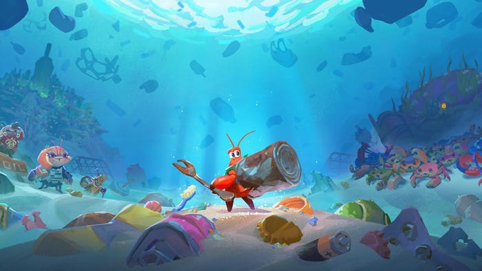
BusinessAnother Crab's Treasure sells 30,000 units within its first dayAnother Crab's Treasure sells 30,000 units within its first day
Aggro Crab's third game is yet another 2024 indie doing pretty well right out the gate.


 Cécile Russeil.")


Latest News
Trending


Featured Blogs


Daily news, dev blogs, and stories from Game Developer straight to your inbox